 iOS App · iPhone & Widgets
Retime
A jet lag app that turns one flight into a day-by-day plan for your body clock. The server does the circadian math; a language model only explains it.
iOS App · iPhone & Widgets
A jet lag app that turns one flight into a day-by-day plan for your body clock. The server does the circadian math; a language model only explains it.
Retime turns a flight into a day-by-day plan for your body clock. Every number is computed on the server; a language model only explains it. It did not start that way.
4
travel states
6
stages behind one card
1 / 6
stages is the model
45 min
largest shift in one night
3
widget sizes, one layout
5
models swapped, app untouched

Jet lag is a scheduling problem that most apps treat as a content problem. I spent the first month building the content version, then had to prove to myself it was wrong.
Every jet lag app says go to bed three hours earlier tonight. Nobody does that. The body clock moves about an hour a day — so the problem was never what to do, it was how to cut one correction into steps.
180 ÷ 4 nights = 45 min, snapped to the quarter hour, capped at 90.
One home screen for every day broke on the morning of my own flight. So the trip itself became the state — four of them, each licensing a different kind of advice.
Hold the line. Consistency now makes the next shift cheap.
Walk the clock. Bedtime moves one step tonight, not the whole shift.
Stop shifting. Sleep windows go inside the flight.
Finish it. Light and caffeine timing, 60 min/day east or 90 west.
Precedence is hard-coded: in-flight > post-arrival > pre-flight > no travel.
I started out believing the opposite of what I ship: let the model reason about the whole trip. Four broken outputs took the arithmetic away from it, one move at a time.
Reads well in a pitch.
"Try to sleep on the plane" — for a 14-hour haul and a 90-minute hop alike.
Shown 7 flights, it printed "Boston → LA" for a SFO→ORD trip.
Told to spread a shift over days, it spent it all on day one.
It shifted a westbound traveller the wrong direction.
The model never lost its job — it lost the calculator.

Each minute Retime shows you is computed or written, never both. Drawing that one line is the decision the rest of the app hangs from.
The reversal, made concrete.
One of four states
The leg that matters
Shift ÷ days, ≤ 90 min
Four categories, prose
Schema, then overwrite
Widget, notifications
Five of the six are pure functions with unit tests — so the model can be wrong without the numbers being wrong.
TypeScript · Zod · deepseek-v3.2 · PostgreSQL · APNs
One real card, split by who wrote each line. Numbers are structural — tappable into alarms. Prose only explains them. The user is never told which is which.
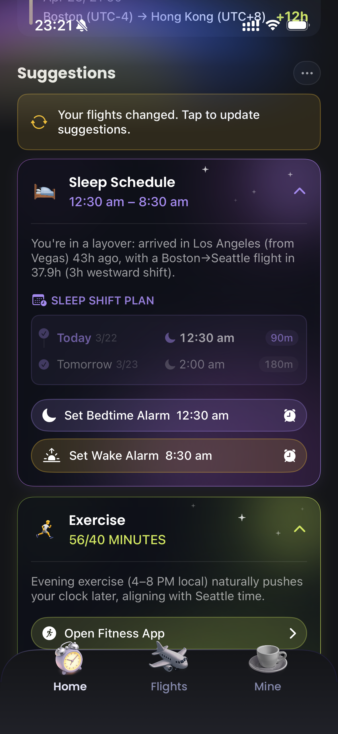
12:30 am – 8:30 am
computed
The one thing a half-awake person reads, so the one thing the model can't touch. computePostArrivalPlan() stamps over its answer.
"You're in a layover: arrived in Los Angeles (from Vegas) 43h ago, with a Boston→Seattle flight in 37.9h (3h westward shift)."
written
Every fact came from the context block. The model's contribution is that it reads like someone who has seen your itinerary.
Sleep shift plan — 12:30 am (90m), then 2:00 am (180m)
computed
Section 01's staircase, rendered. Tomorrow next to tonight turns an instruction into a plan.
"Evening exercise (4–8 PM local) naturally pushes your clock later, aligning with Seattle time."
written
The mechanism, in one line. People stay with a schedule longer when they know which way it pushes.
Same principle in the banner: a plan that rewrites itself while you're following it isn't a plan. Recomputation is always something you ask for.

A plan is worthless if you cannot read it one-handed, at a gate, at six in the morning. So colour carries the schedule and text only confirms it.
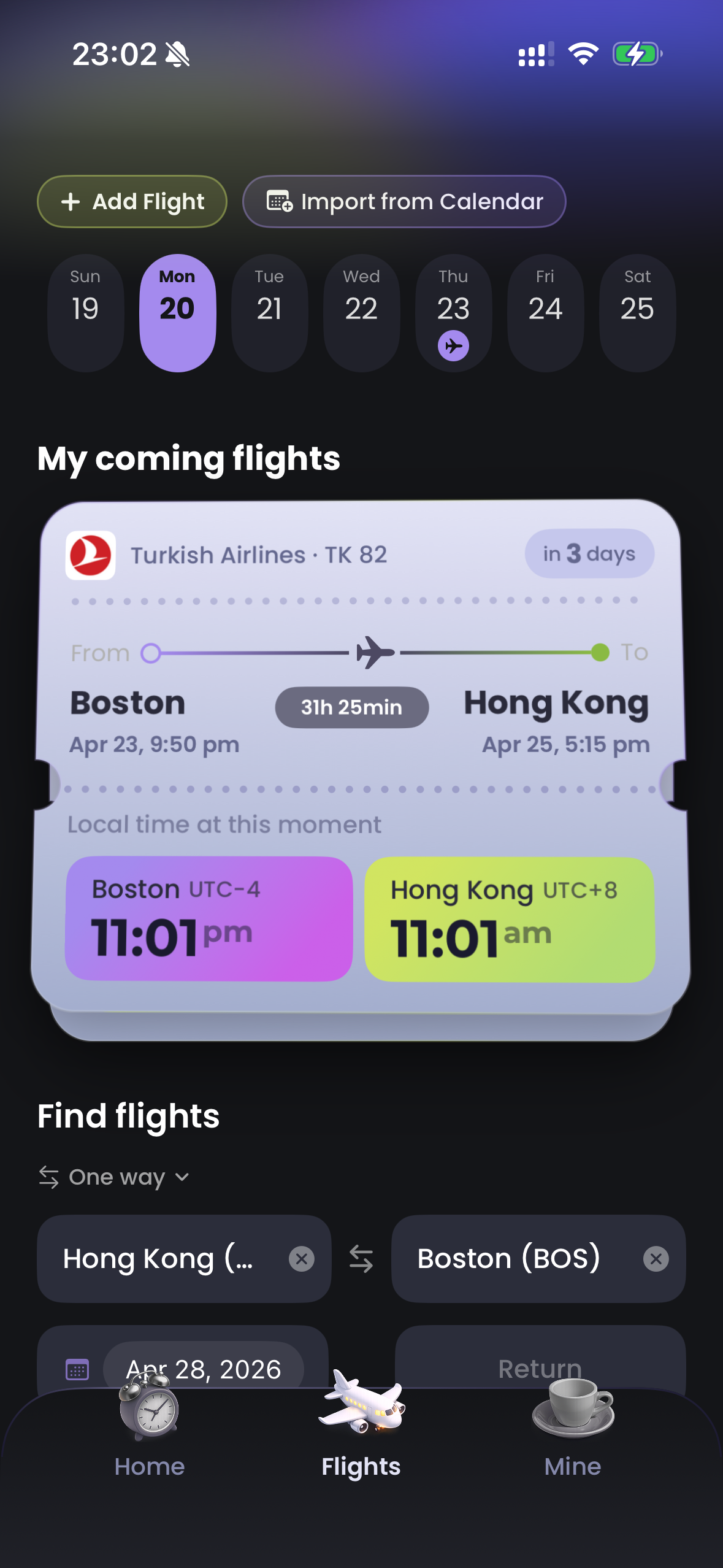
Two clocks, both reading 11:01. It takes a beat to work out which one you're standing in — and UTC−4 / UTC+8 are correct but useless at a gate.
So the palette carries the information. Purple is night. Lime is day. You know which clock is yours before you have read either number.
The two accents only ever mean asleep and awake — in clocks, cards and every route gradient.
Boston
UTC−4 · EDT
11:01 pm
night
Hong Kong
UTC+8 · HKT
11:01 am
day
The header pair, rebuilt in HTML. Same numerals, opposite meaning.
Hierarchy comes from weight, not size — so a 20pt city and a 24pt time share a row without competing.
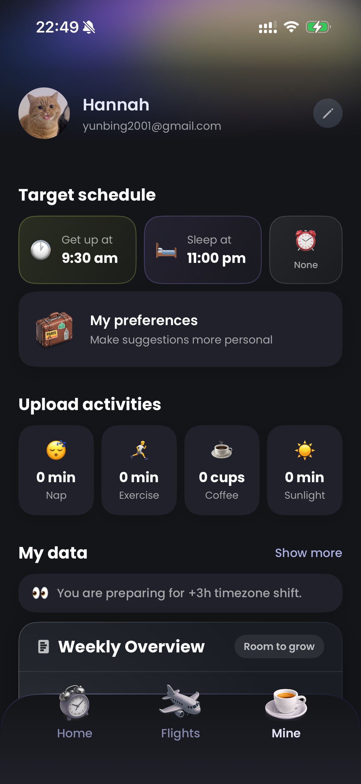
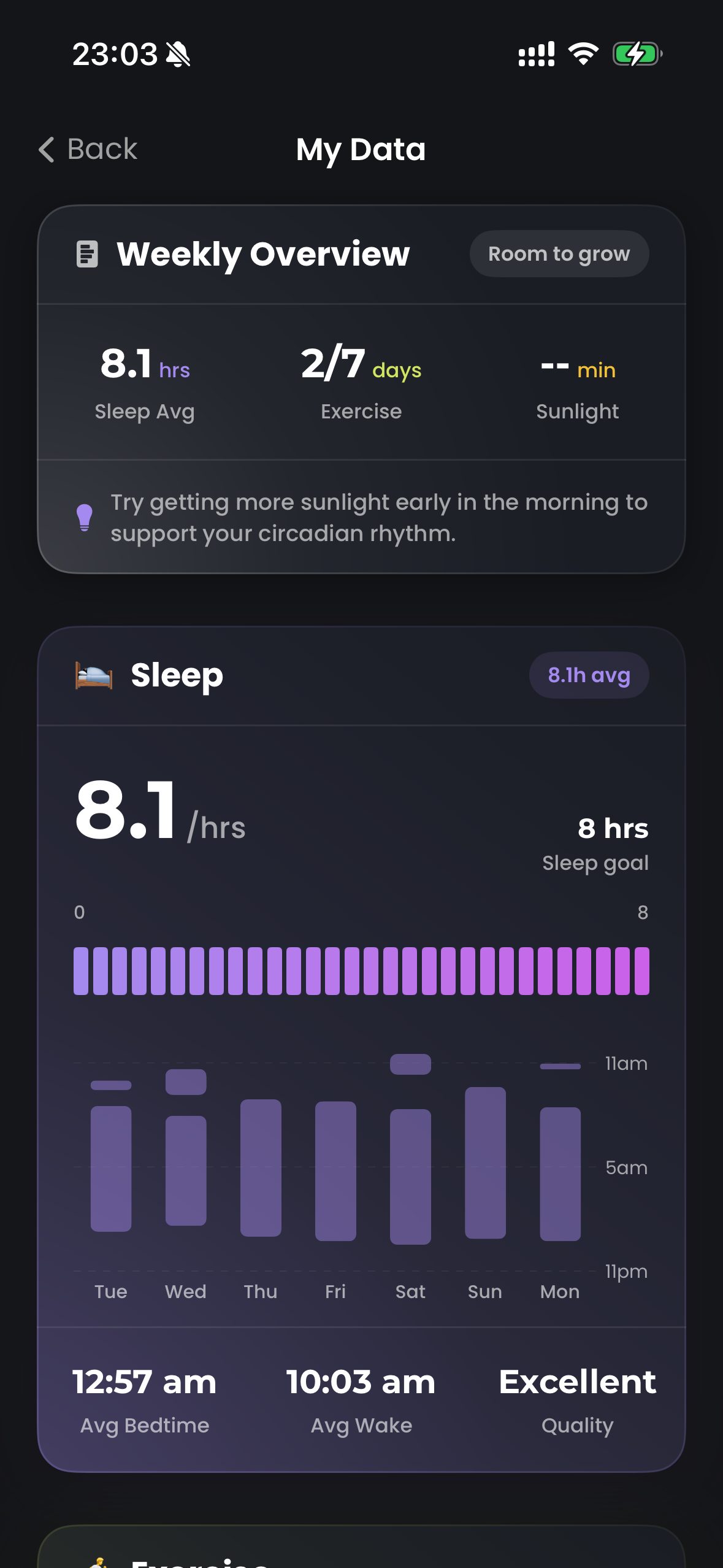
Three tabs, because a traveller only has three questions: what do I do now, where am I going, who does this app think I am.
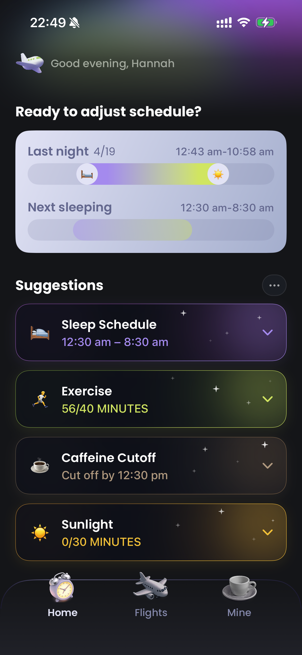
Home — what do I do now
Four cards in a fixed order — sleep, exercise, caffeine, sunlight — so the one you want is always in the same place.
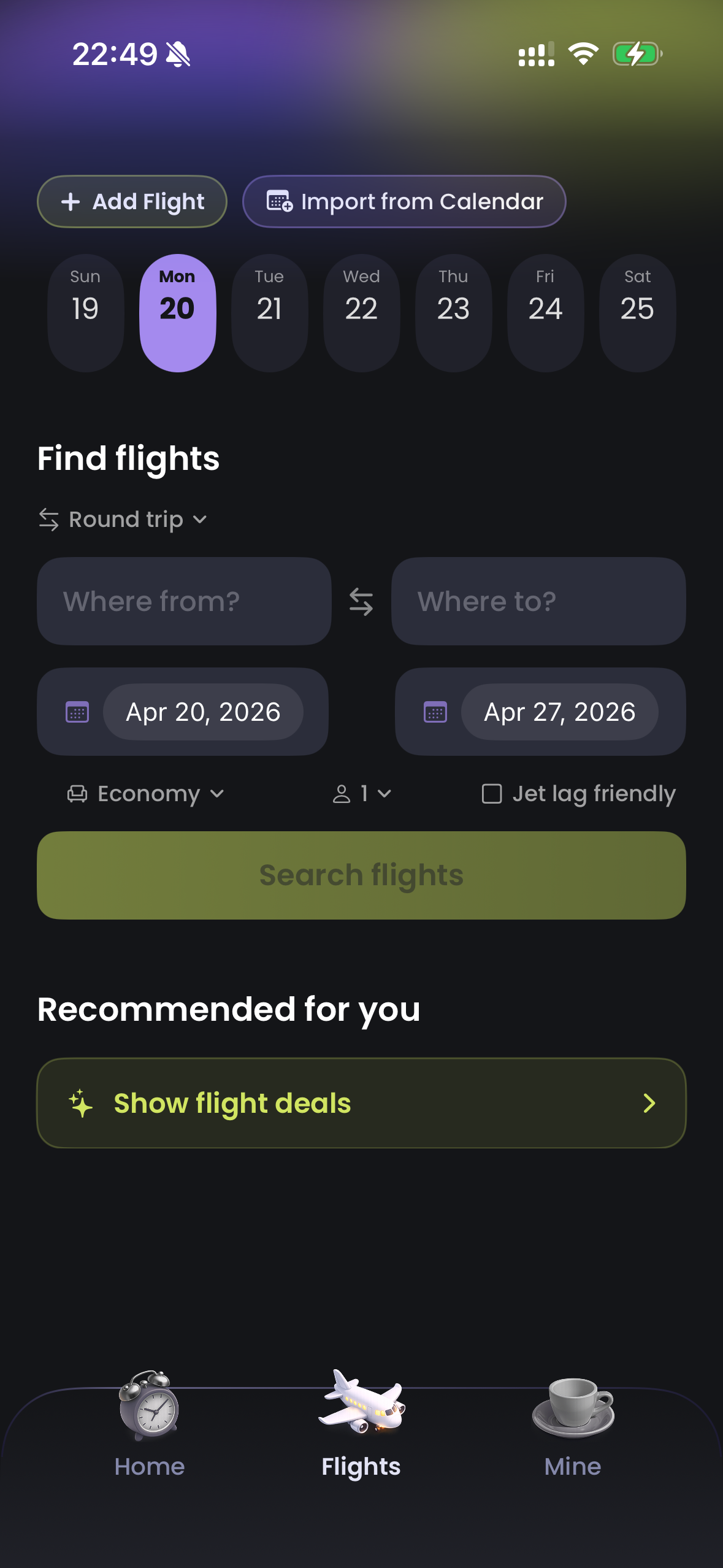
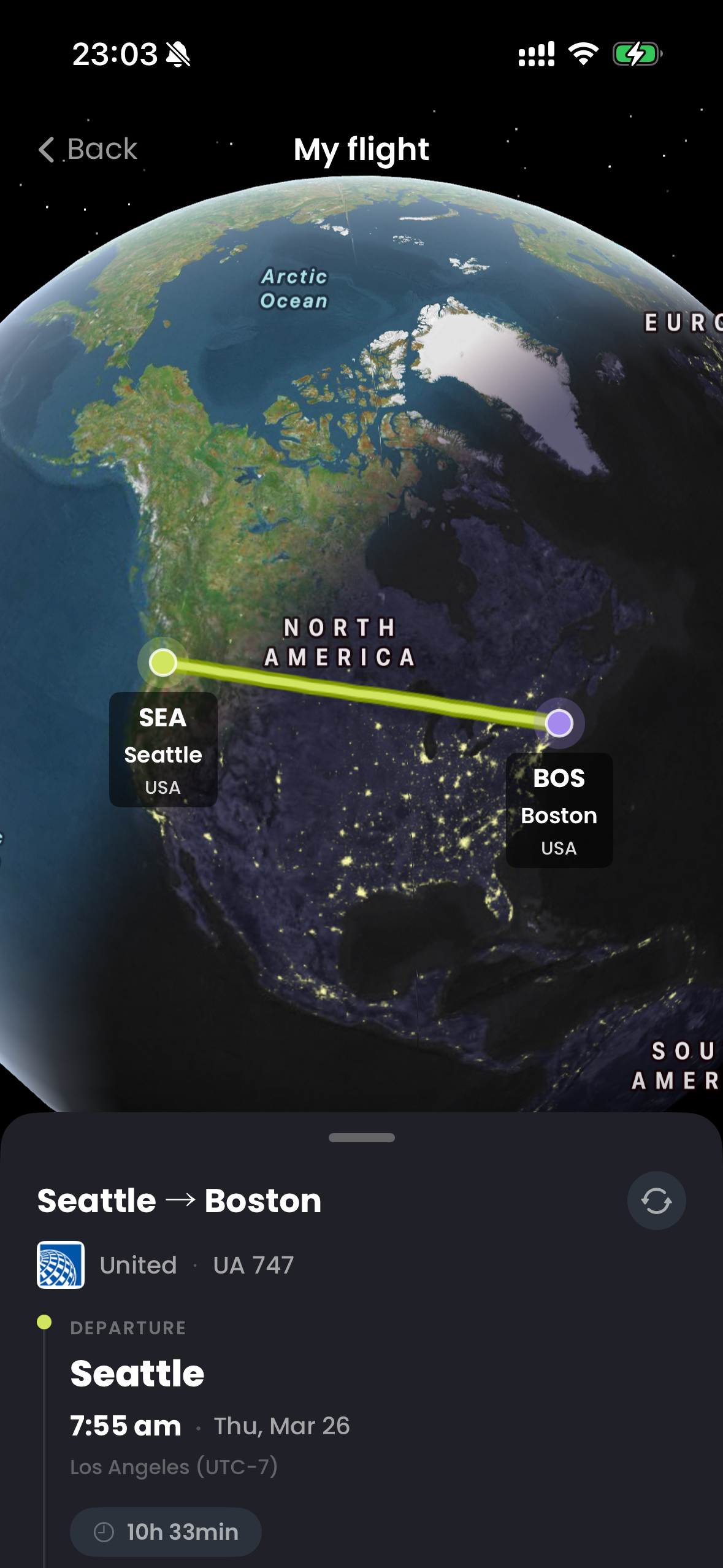
Flights — where am I going
Entered once, read constantly — so it's drawn as a ticket.
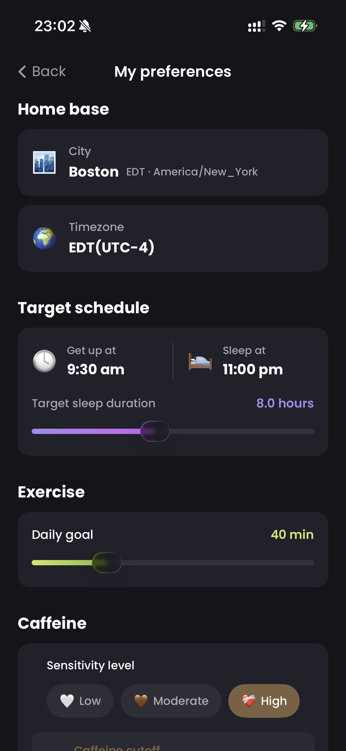
Mine — who does this app think I am
Every input here changes a number in the pipeline. Nothing else is collected.
Widgets — the plan without the app
The plan matters when you reach for coffee, so it lives outside the app. Three depths: when → where → what to do.
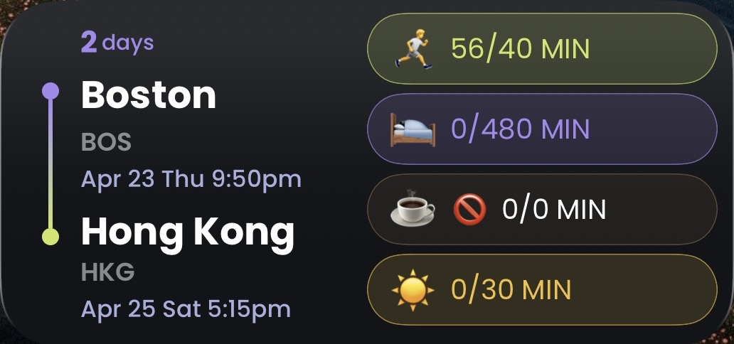
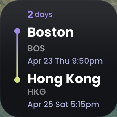
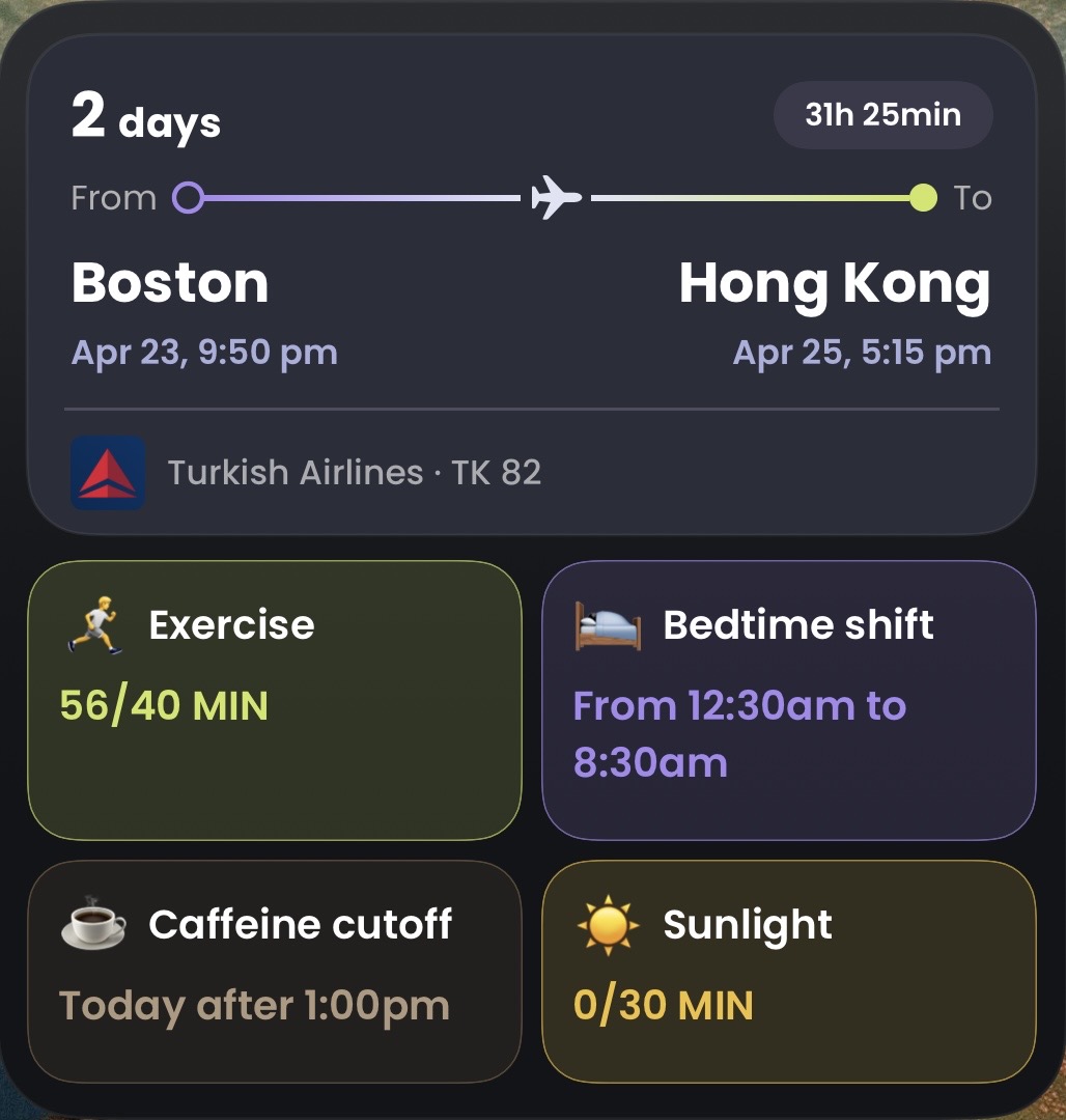

Nine decisions, what each one bought, and what I gave up to get it — including the ones still unpaid.
Six choices that shaped the product, each with what it cost.
Compute every sleep time on the server
not trust the model's schedule
WhyA wrong direction deepens jet lag. Arithmetic shouldn't be probabilistic.
GainedTimes that are always right, and unit-testable
Gave upThe model can no longer surprise me with a better plan
Serve a stale plan over an error state
not "couldn't load — retry"
WhyYesterday's bedtime is off by 45 minutes. An error screen is off by everything.
GainedThe app always has an answer
Gave upA silently outdated plan is possible
Exactly four categories, always
not let the model choose what matters
WhyA fixed set buys muscle memory — caffeine is always third.
GainedA layout that never reflows
Gave upNo room for a fifth lever like meal timing
Two accents carry day and night
not labels and timezone offsets
WhyTwo clocks reading 11:01 are identical as text. Colour separates them pre-attentively.
GainedOrientation without reading
Gave upTwo hues spent — they can't be reused for anything else
The server owns the state machine
not duplicate the logic on device
WhyApp, widget and push must agree. Two implementations means two answers.
GainedOne truth across app, widget and push
Gave upThe client can't recompute while offline
A wheel picker for bedtime
not chevron steppers
WhyBuilt steppers first, replaced them 21 minutes later. An hour was eight taps.
GainedOne gesture instead of eight taps
Gave upA popover, so the value is hidden while editing
A working build on my own phone, not a shipped product. I've validated the engineering, not the premise.
Shipped & working
Cut or never built
What I'd fix first
The model changed five times. When the thing behind the boundary is that replaceable, the boundary is the design.
Part photographs by alex°, Ross Parmly, Big Dodzy and Jack Cohen on Unsplash.