H
Icovela · Solo product · Live

Teaching a random model to hold a style.

Icovela generates complete app icon sets. The hard part was never making a pretty picture — it was making the same instruction produce the same look, ten styles deep, every single time.

Role Solo — product design, visual design, front-end, back-end, payments, prompt system
Timeline Apr 2026 → ongoing
Type Live SaaS product, self-funded and self-shipped
Stack Next.js · TypeScript · Tailwind · OpenAI GPT Image · Prisma · Stripe
01

An icon is not the unit of work. A set is.

Icovela's users are people shipping their own products: developers who have never had to think about icons, and designers who know exactly what they want and would rather not draw it six times. Launch day needs six images, not one, and all six have to read as the same object across a 16× scale difference.

Icon at 512 pixels 512 Primary, Alt A, Alt B
The same icon at 96 pixels 96 Notification
The same icon at 60 pixels 60 Small
The same icon at 32 pixels 32 Favicon

Drawn to true relative scale. Detail that carries the 512 is gone by the 32 — so the set has to be designed, not just generated.

Primary512×512
Alternate A512×512
Alternate B512×512
Notification96×96
Small60×60
Favicon32×32
Why the existing tools didn't solve it
01

They return one image

Ask for six related assets, get six unrelated ones.

02

They drift

Light, perspective and palette move on every regenerate. Invisible on one icon, fatal across a set.

03

A text box isn't control

Prose is the wrong instrument for an aesthetic — for beginners and professionals alike.

The reframe
The job isn't “make me an icon.” It's “make me six icons that look like the same designer made them.”
— the sentence that decided the entire architecture
02

So there were two problems: choosing a style, and holding it.

Choosing shouldn't be typed. Nobody describes an aesthetic in prose reliably, and plenty of users don't yet know which aesthetic they want — so the styles are decided in advance and the user points at one. Holding a style is my job either way: same prompt twice, two different pictures. For one illustration that randomness is the feature; for a set it's the defect. So the object of design was not an image generator but a control system on top of one.

Principles I held myself to
P1

Recognition over description

Nobody can write “frosted glass over an opaque back layer.” Everybody can point at it. Every aesthetic choice is a pick, never a sentence.

P2

Hide the machine

If an option only has one right answer, it isn't an option. It's a default I owe the user.

P3

Never charge for a failure

A stochastic system fails sometimes. Pricing has to assume that from day one, not patch it later.

icovela.com
Icovela landing page — flat black, white and cyan layout

The product's own surface: off-white ground, a single accent, no borders and no shadows. This case study page is built in that same language on purpose.

03

Four decisions that shaped the interface.

Each one trades user freedom for predictable output. That trade is the product.

D1

Style before subject

Traded away

The prompt box as the first move.

What it bought

The style is settled before the user types. Their phrasing cannot destabilise it.

icovela.com
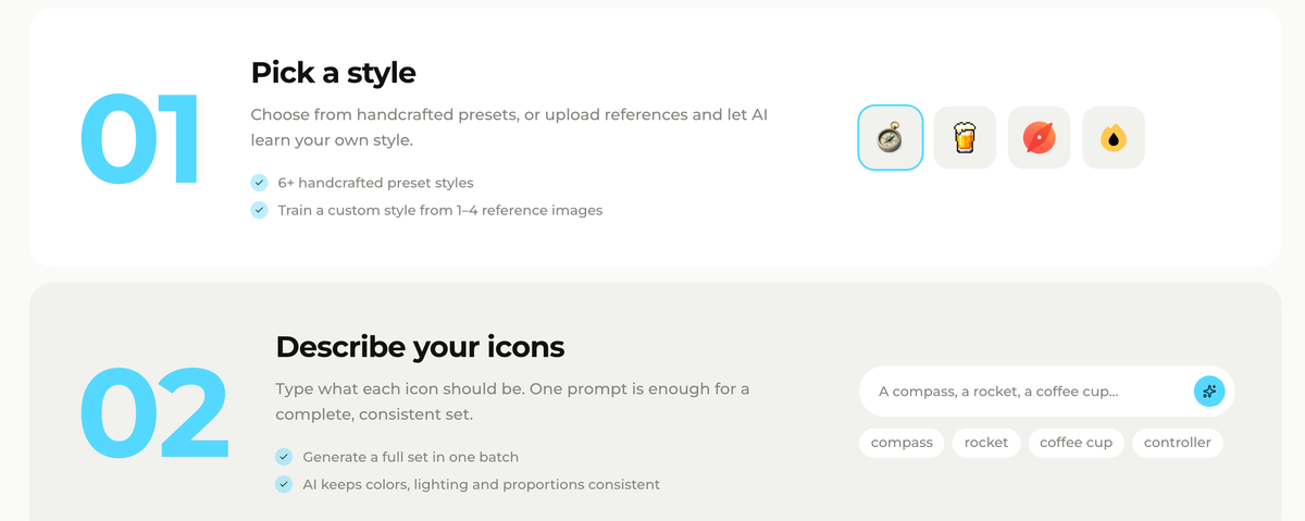
Icovela's How it works section: step 01 is Pick a style, step 02 is Describe your icons
The order is the decision. Style is step 01; the subject is step 02.
D2

The style lives in a reference image, not in text

Traded away

Transparency. Every style carries a reference grid, attached server-side, shown nowhere.

What it bought

Prose describes intent. An image is the intent.

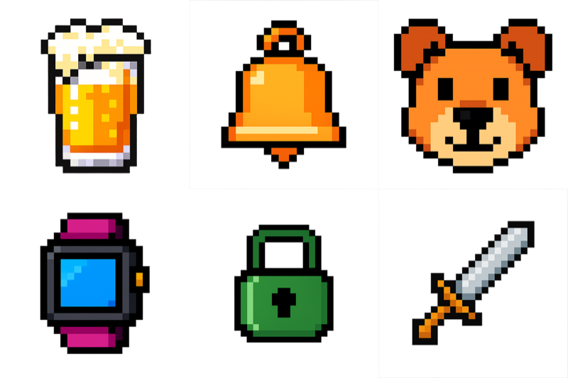
A six-icon reference grid generated for the Pixel Art style: beer glass, bell, dog, smartwatch, padlock and sword
The Pixel Art reference: six unrelated subjects, made by me, sent with every request, shown to nobody. Style and subject then have to be held apart — early on, “camera” and “rocket” came back as the grid's own gemstone and wand.
D3

History is a column, not a dropdown

Traded away

300px of canvas, permanently.

What it bought

Comparison instead of linear refinement. Nothing overwrites anything.

280pxControls
FlexibleCanvas
300pxHistory
A quarter of the workspace is permanently spent on things the user already made.
D4

Failed generations refund themselves

Traded away

Revenue on every failure. Balance check and debit are one atomic operation.

What it bought

Legible pricing: 10 credits, one icon, no asterisks.

icovela.com/pricing
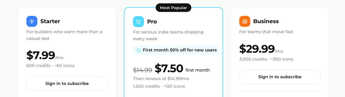
Icovela pricing plans, each stating both a credit balance and the icon count it buys
Every plan states the icon count, not just the credits. The 10:1 rate never moves.
10credits per icon
100credits per animation
0charged for a failed generation
6slots in every set
04

Ten styles. Wildly different amounts of work.

Every style is a specification debugged against a system I can't step through. I versioned each one, so the cost is on record.

Isometric 3D 1
Minimalist 3D 3
Flat Cutout 3
Bold Editorial 6
Candy 3D 6
Duotone Flat 6
Plump Flat 6
Pixel Art 8
Colour-block 9
Glassmorphism 10+
Soft Gradient 11
Passed on the first prompt Shipped after iteration Abandoned

Prompt versions per style, from my iteration log. Which style takes one round and which takes eleven is unpredictable — hence one fixed test for all of them.

And the model is a per-style decision, not a global one
5 styles · gpt-image-1 5 styles · gpt-image-1.5

Upgrading the flat styles brought the outlines straight back. Half the library runs on the older model by choice — invisibly.

05

The library, shown as evidence rather than a gallery.

Ten styles, picked because they are what app icons actually look like now — the research is done, so the user chooses instead of hunting. Each one shown against unrelated subjects, because a style that only works on a camera isn't a style.

Isometric 3D

gpt-image-1.5
Isometric 3D icon Isometric 3D icon Isometric 3D icon Isometric 3D icon Isometric 3D icon Isometric 3D icon

Glassmorphism

gpt-image-1.5
Glassmorphism icon Glassmorphism icon Glassmorphism icon Glassmorphism icon Glassmorphism icon Glassmorphism icon

Minimalist 3D

gpt-image-1.5
Minimalist 3D icon Minimalist 3D icon Minimalist 3D icon Minimalist 3D icon Minimalist 3D icon Minimalist 3D icon

Candy 3D

gpt-image-1.5
Candy 3D icon Candy 3D icon Candy 3D icon Candy 3D icon Candy 3D icon Candy 3D icon

Duotone Flat

gpt-image-1
Duotone Flat icon Duotone Flat icon Duotone Flat icon Duotone Flat icon Duotone Flat icon Duotone Flat icon

Flat Cutout

gpt-image-1
Flat Cutout icon Flat Cutout icon Flat Cutout icon Flat Cutout icon Flat Cutout icon Flat Cutout icon

Plump Flat

gpt-image-1
Plump Flat icon Plump Flat icon Plump Flat icon Plump Flat icon Plump Flat icon Plump Flat icon

Pixel Art

gpt-image-1
Pixel Art icon Pixel Art icon Pixel Art icon Pixel Art icon Pixel Art icon Pixel Art icon

Soft Gradient

gpt-image-1
Soft Gradient icon Soft Gradient icon Soft Gradient icon Soft Gradient icon Soft Gradient icon Soft Gradient icon

Bold Editorial

gpt-image-1.5
Bold Editorial icon Bold Editorial icon Bold Editorial icon Bold Editorial icon Bold Editorial icon
06

One mode where the user supplies the reference.

Everywhere else the reference image is mine and the subject is the user's. Here the roles swap: they supply the object, the style stays fixed. Same engine, no new interface — only possible because the reference image was already the unit of control.

Original photograph before conversion User's photo
The same object rendered as a styled 3D icon Generated icon
07

Designing the twenty seconds I couldn't remove.

0s10s30s

A generation lands anywhere in the blue. No signal tells me where.

Too long for a spinner to feel honest, too short for a progress page. With no completion signal, a percentage bar would be a lie.

So the loader is the Icovela mark: bobbing 5% over 2.4s, three bumps breathing 1× to 1.25× at 0.22s stagger. Branded, alive, honest about not knowing how long is left.

08

What I'd do differently.

01

Test six subjects from round one

Early rounds validated single lucky outputs. The signal that mattered — does this hold across unrelated subjects — came last.

02

Set a limit before starting over

One style absorbed ten rounds before I accepted I was solving the wrong problem. A cap on attempts would have got me there sooner.

03

Instrument style-level satisfaction

I track the funnel but not per-style keep-versus-discard rates — the one number that would tell me which style to work on next.

The whole argument is that it comes out the same way every time.

Easiest way to check that claim is to go and try to break it.

Back to Home Next Project