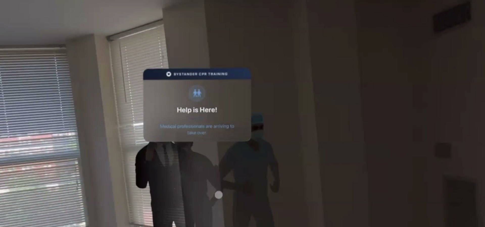
Out of hospital
Bystander
First person on scene. Plain language, hands-only CPR, no prerequisites.
 visionOS · Medical XR
Cardiac arrest training on Apple Vision Pro.
Overview
Four training modes on Apple Vision Pro, hand-tracked CPR feedback, and a code team rehearsing together over SharePlay. I designed the mode architecture, every in-headset interface, and the real-time feedback system.
Full walkthrough, 1:45 — all four modes, on device and in the visionOS simulator.
01 / Why
We started from the resuscitation literature rather than a product idea.
Straying from ACLS during a code correlates with worse survival.
Score deviations, not completion Crowley et al., 2020Retention tracks how often you practise, not how well you passed.
Make one more rep nearly free Nishiyama 2014 · Silva 2025Manikin labs are expensive, scheduled and location-bound.
Any flat surface becomes the sceneBest-practice guidance trains the team, not individuals.
Multi-user by default, roles first Anderson et al., 2021Layperson training measurably improves out-of-hospital survival.
A mode with no clinical vocabulary Tabata et al., 2024The AHA's 2030 goals name training access as the lever.
Cost per rep is the product Merchant et al., 202402 / The system
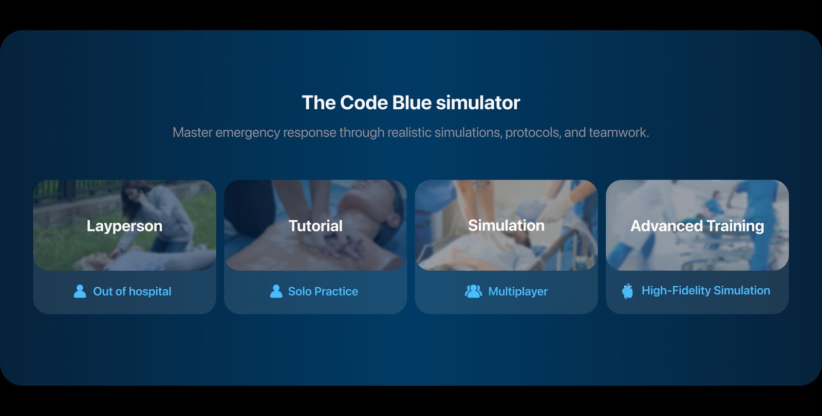
The main menu is the whole product on one screen. Four modes sit in a rail that never moves; picking one only redraws the pane beside it, so you can weigh the options without losing your place.
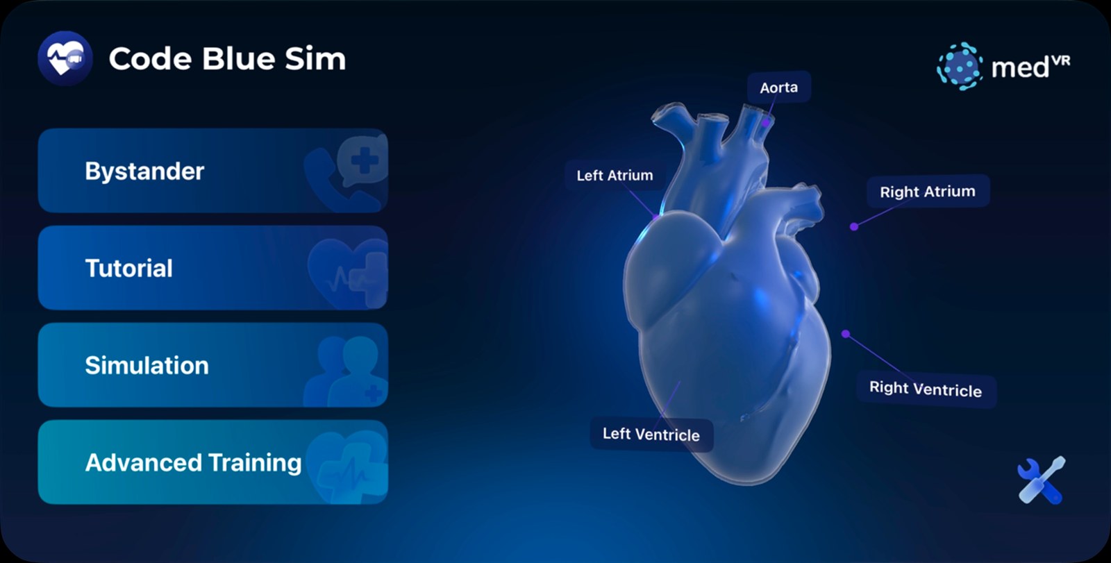
Idle state. The heart stays on screen while you decide — the only ornament in the app that is also the subject.
First person on scene. Plain language, hands-only CPR, no prerequisites.
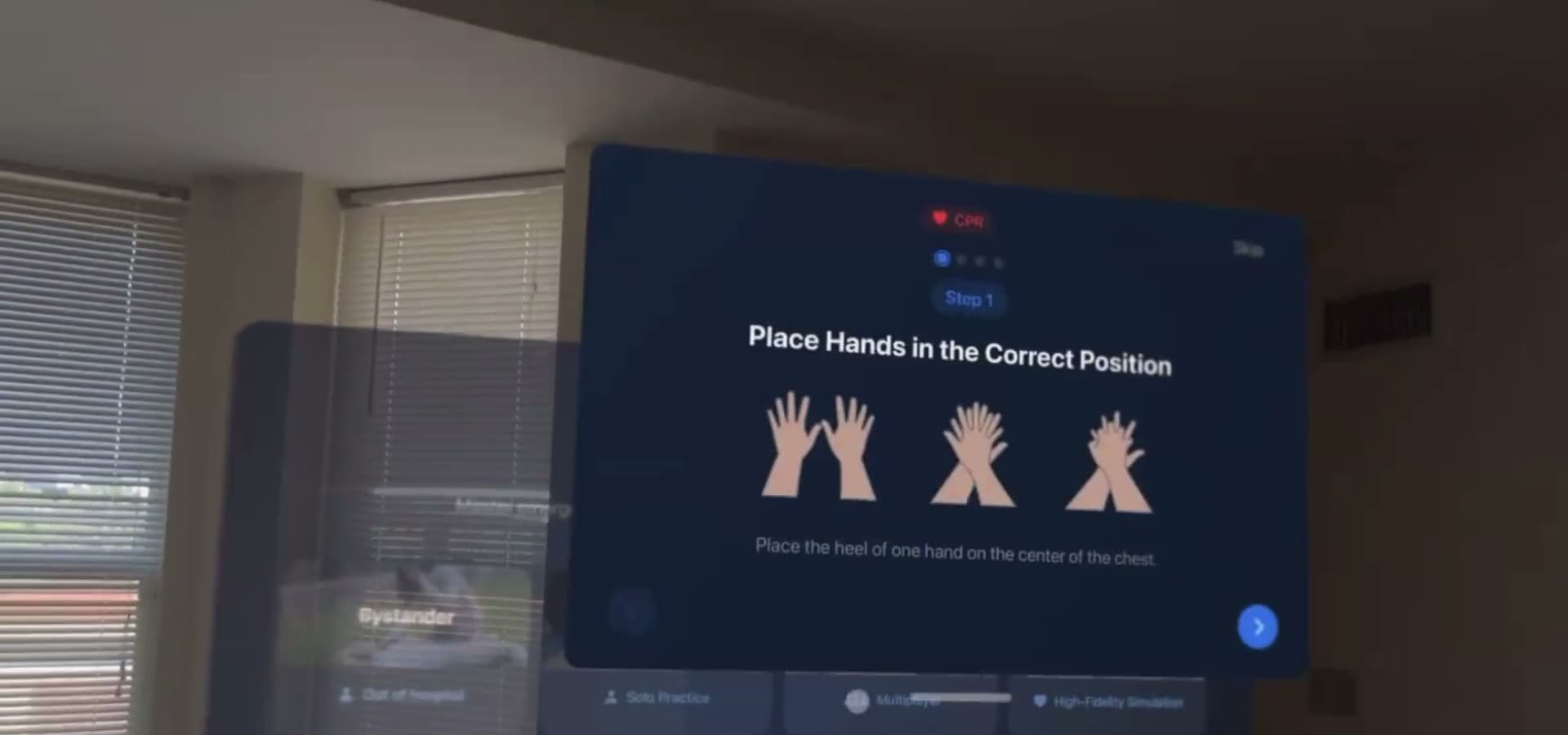
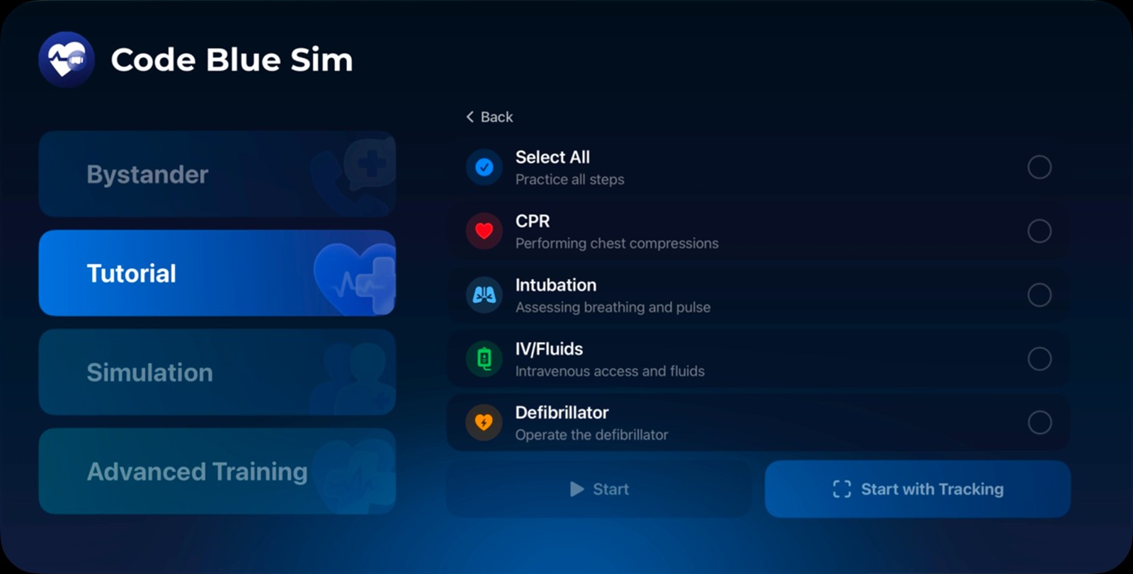
Four skills — CPR, intubation, IV, defibrillator — drillable one at a time.
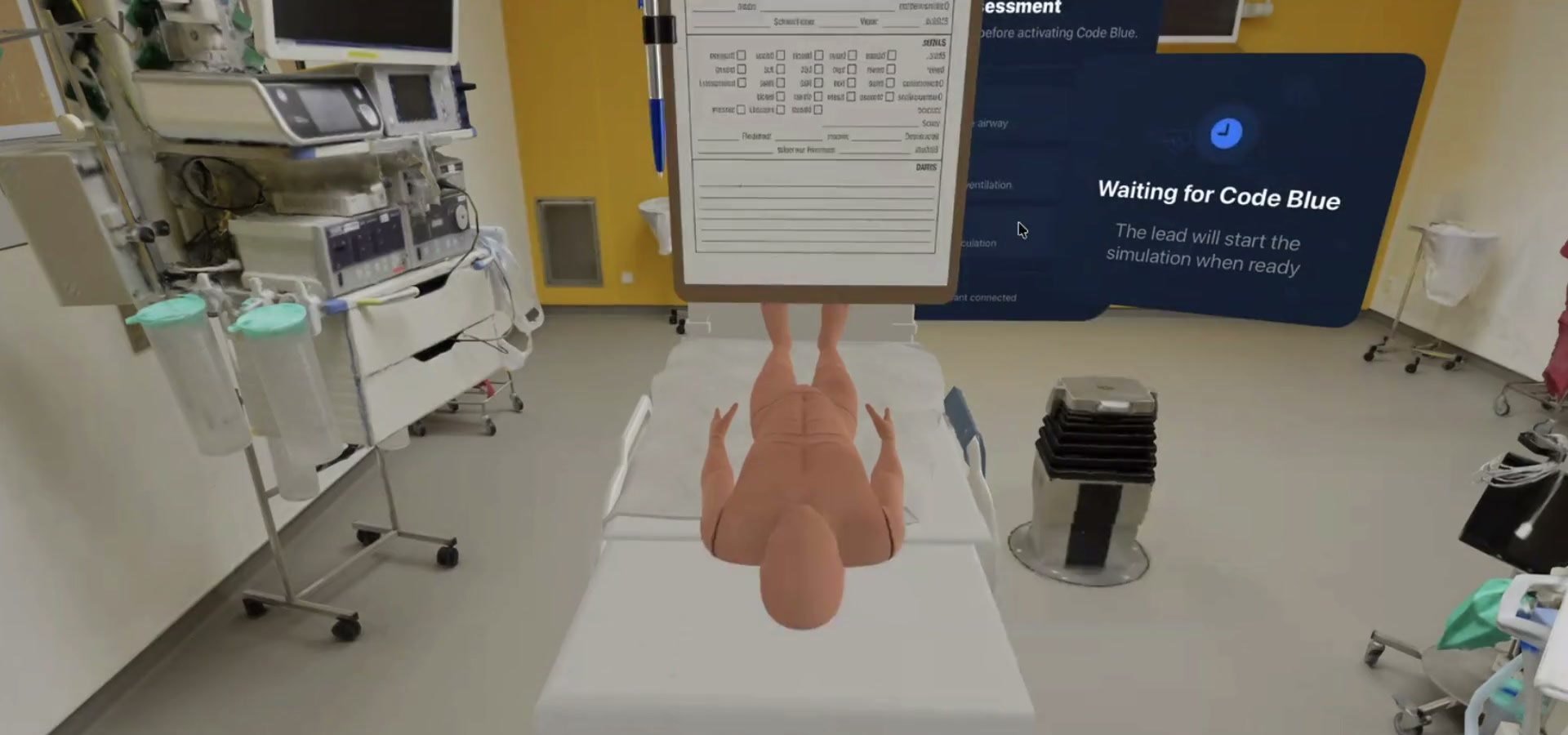
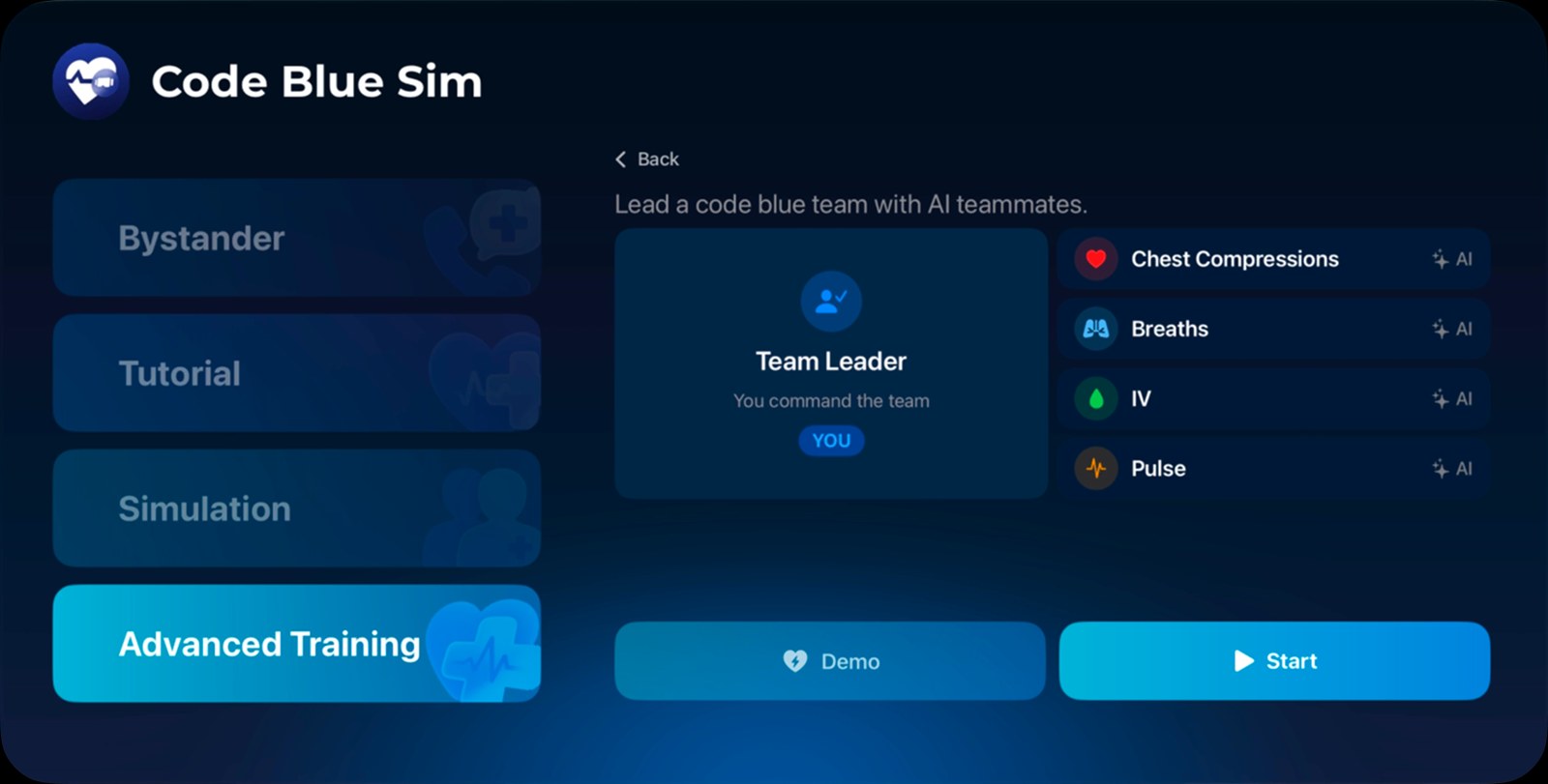
A full code over SharePlay. Roles assigned before the clock starts.
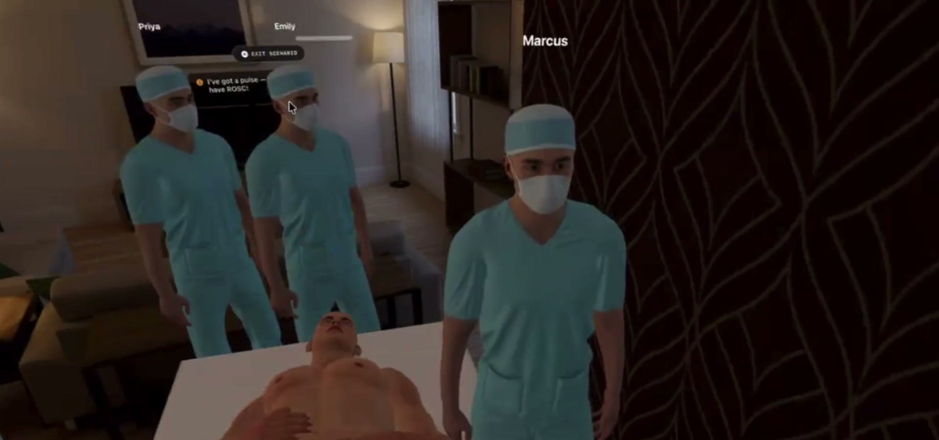
You take team leader. AI teammates cover the other four roles.
Two modes need only a sentence and a start button. Two need a real decision made before the clock starts — which skills to drill, or which role you take.




The broken heart is the only harsh mark in the set — the one place the product is blunt.
03 / Design system
Four modes, five roles and two engineers is enough surface area for a UI to come apart. So the design system does not live in a Figma library that the code slowly stops matching — it lives in the repo as a markdown rule file scoped by file path, which means it is loaded into context automatically whenever anyone (or any coding agent) opens a SwiftUI view.
---
globs:
  - "**/Views/**/*.swift"
  - "**/*View.swift"
  - "**/*Style*.swift"
---

# CodeBlue Design System
Medical emergency training app for visionOS with a dark, immersive blue theme.
The frontmatter is the whole trick. Those three globs decide when the system is in the room.
Every colour, size and radius exists once, as a markdown table in the repo. Spec and implementation move in the same commit, so there is no version of the system that is quietly out of date.
A ten-step scale where 500 means “badge background” and 700 means “primary fill” is a rule an agent can follow. Slightly darker blue is not.
Python scripts render the token lists straight to swatch, type and component sheets. Re-exporting the system after a change is a command, not an afternoon of moving rectangles.
Six scales, all built the same way, and the step number is a job description, not a brightness. 300 is an elevated surface, 700 is the solid interactive fill, 900 is text on a dark plate. Nothing in the codebase is allowed to name a raw hex value.
The 700 step is the default interactive fill for every scale. Role colours map straight onto it — CPR is red-700, IV is green-700, Pulse is orange-700, Lead is blue-700.
Swipe the scale sideways →
Never colour alone: every status colour ships with an icon and a text label, because a green dot in a headset at arm’s length is not information.
visionOS text is read at a distance, through a lens, often by someone kneeling on the floor. The system floors standard UI text at 24 pt and caps it at 40 pt — and separates vital-sign numbers into their own family so they can be monospaced and never reflow mid-compression.
Specimens are scaled down to fit this page; the labelled values are the real visionOS points.
Compression depth and rate are read while someone is pushing on a chest, so metrics are monospaced — the number changes without the layout twitching.
Five variants, four states, and not a single hand-picked colour — every state is one step along the variant’s own scale. Typography is set by the button’s size, never by its variant, so a destructive button and a primary button are always the same shape.
Hover moves one step brighter, active moves one step darker and scales to 0.97 so a press reads as pressure, and disabled is simply the default fill at 40% opacity. Swatches below show each variant’s fill token; Primary ships as a two-stop blue-800 → blue-700 gradient. No outlines anywhere — the fill difference carries the separation.
Swipe the matrix sideways →
Radius encodes depth rather than component type: 46 pt for any surface floating directly in the immersive space, 16 pt for anything nested inside another surface. The same metric card is 46 pt beside the patient and 16 pt inside a window.
04 / Interaction
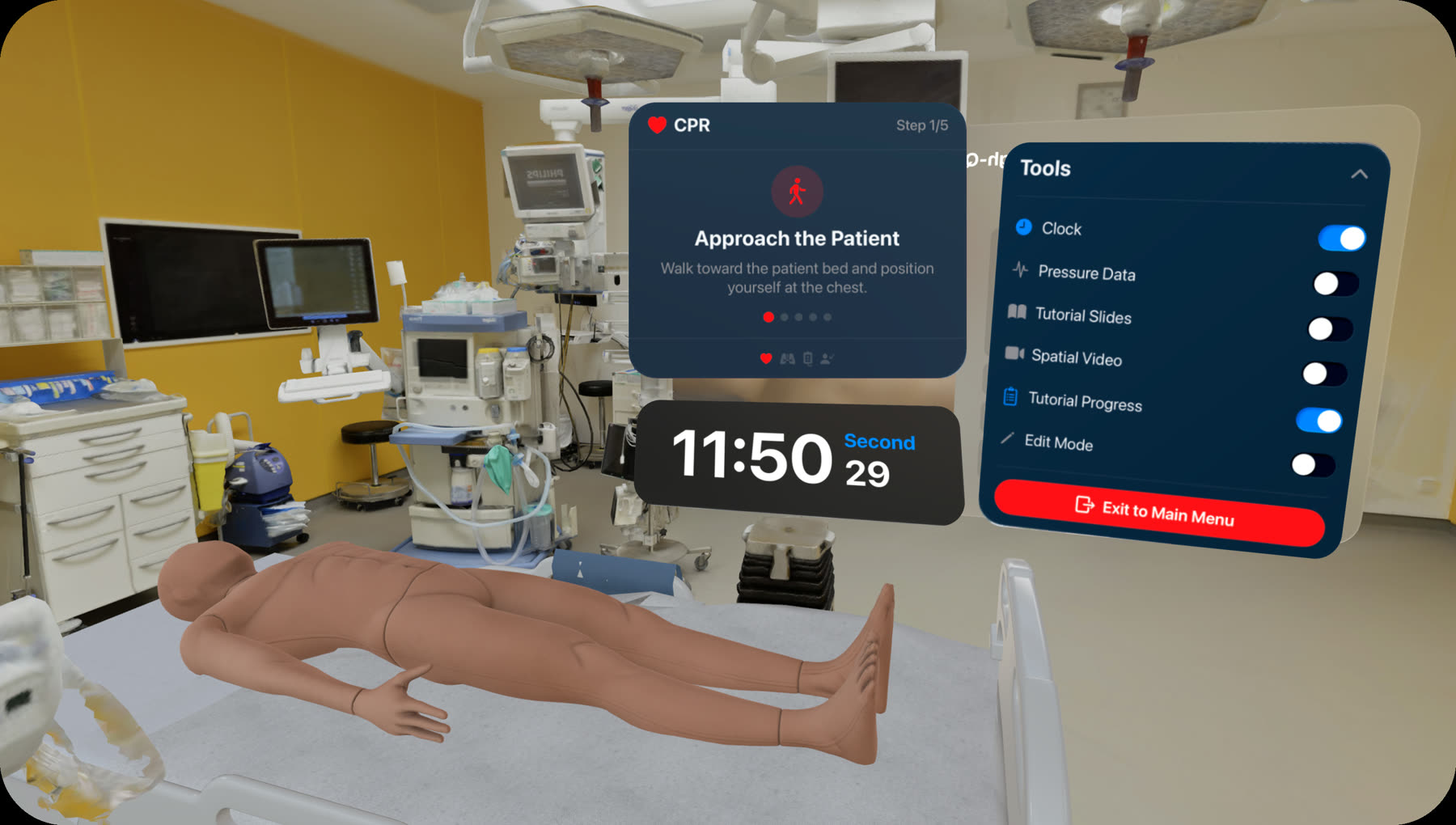
visionOS runs on look-and-pinch. During compressions you have no free hands and your gaze is on the chest — the default input model is simply unavailable.
Compressions advance the step themselves. Taps exist only where hands are legitimately free.
Panels sit beside the patient at chest height, so looking down doesn't drag them over the chest.
Reviewable numbers on a persistent panel. Act-now corrections as audio plus one large card.
Under stress, a five-bullet panel is a panel that gets skipped.
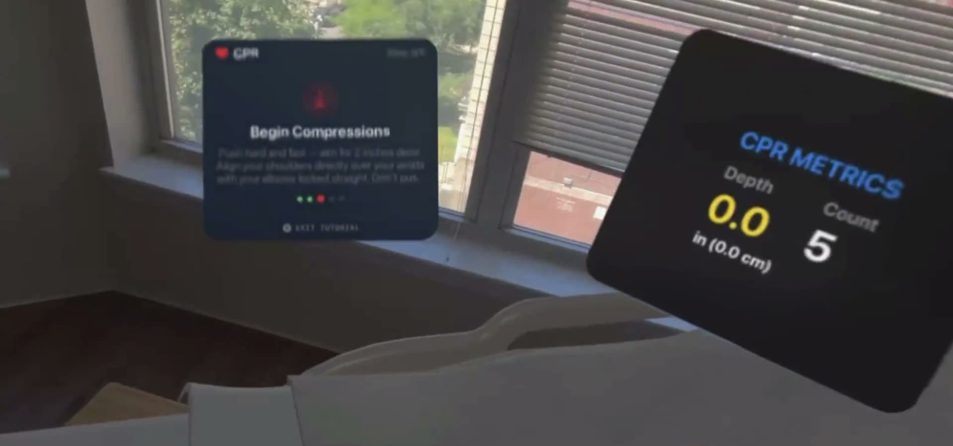
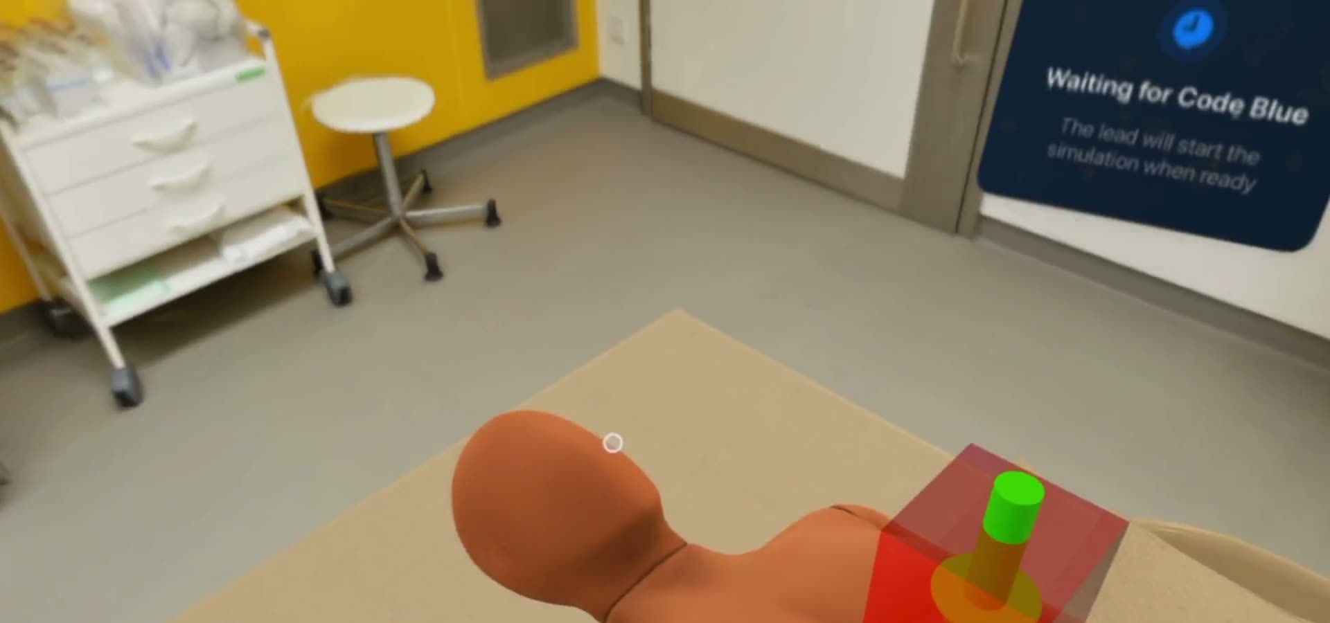
You cannot watch a rate meter while compressing, so in step 3 of the tutorial the target moves from the eyes to the ears.
Inside the AHA window of 100–120. Press play and stop watching the screen.
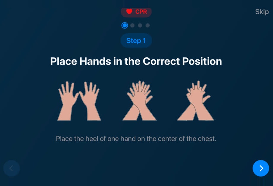
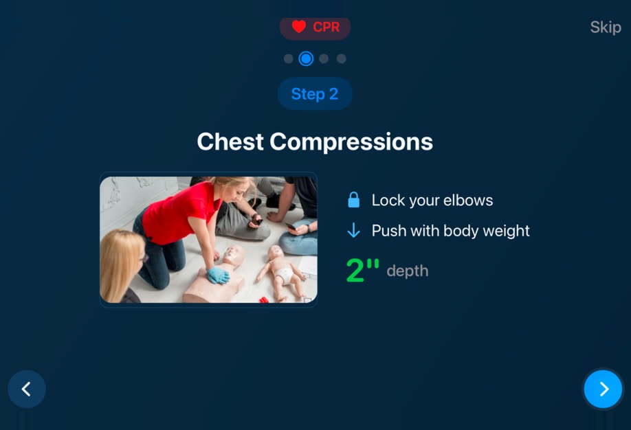

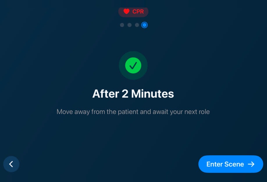
Four steps: hand position, mechanics, rate, rotation. Step 4 teaches rescuer rotation before the learner ever enters a team scenario.
05 / Feedback
Three correction states. Each names the distance to target instead of pass/fail — that is what lets someone calibrate on the very next stroke.
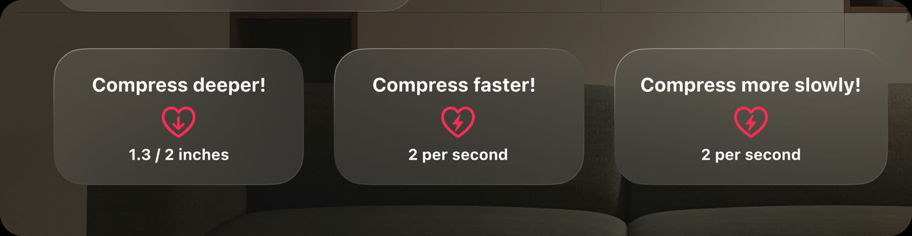
Too shallow, too fast, too slow. One instruction each, throttled so the panel never flickers.
06 / Beyond one headset
Two places the product had to leave the single-user, all-virtual box.
Compressions against empty air teach the wrong motor pattern — but instrumented hardware would destroy the cost argument. So the CPR-cycle poster doubles as the image-tracking marker, and a foam heart supplies the resistance.
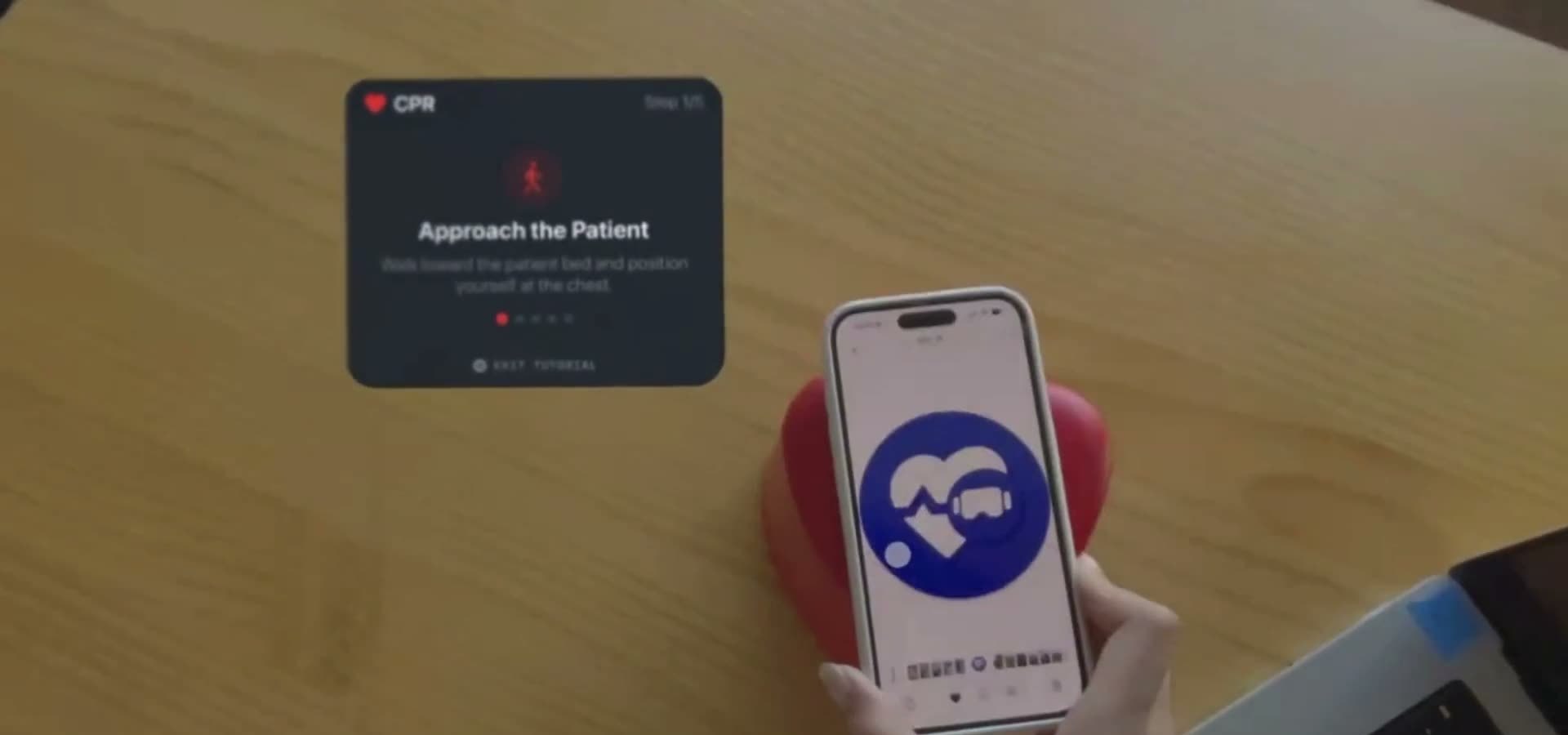
Lay the marker on any surface and the patient registers to it, at real height in a real room. Tracking is always offered as an option, never a requirement.
SharePlay puts people in different physical rooms around one patient. The hard part is not the sync — it is that nobody can see what the others know.
The lead assigns every participant a role before the scenario can start.
While the group assembles everyone sees the same panel, so nobody wonders whether it is broken.
Position and gaze around the bed read the way they do in a real code.
An instructor panel exposes the scenario's inner state, so a facilitator can steer a session without leaving the headset.
07 / Iteration
The first menu was an iPad layout floating in mid-air — four photo cards on a single plane. The rebuild puts the mode rail on its own layer and a 3D heart in the depth behind it, so the first thing you see is a room, not a page.
Early builds ran in a generic gallery space. Context is part of what is being trained, so later builds split into a hospital OR and a living room.
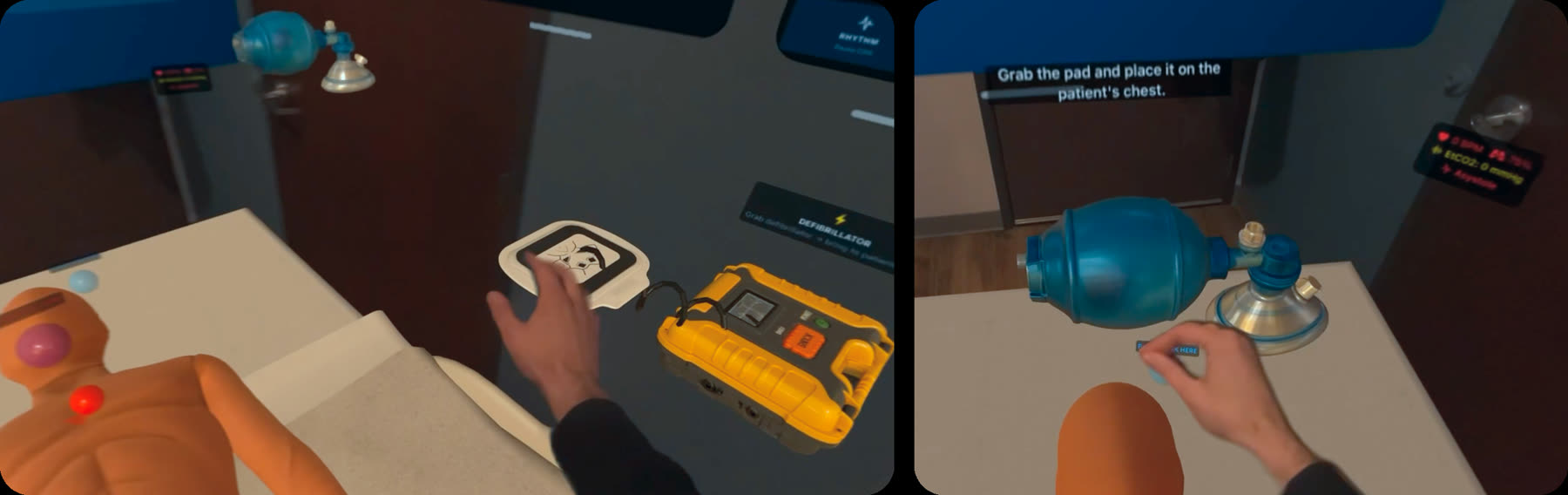
Equipment steps ended up on the same card pattern as compressions, inside environments that match the mode.
08 / Outcome
Co-designed with clinicians throughout rather than reviewed at the end — an MD, PhD from Johns Hopkins Medicine plus advisors from medVR and Northeastern University.
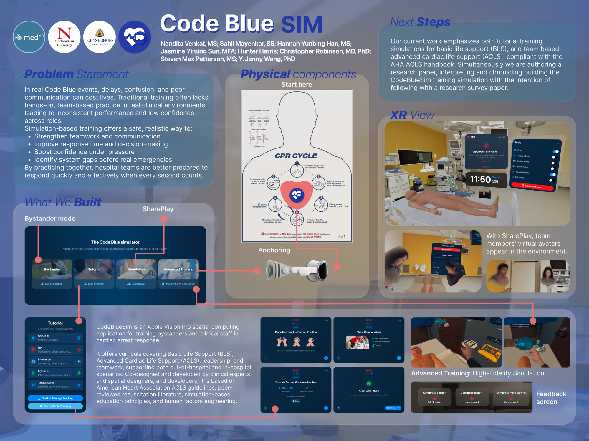
Conference poster, designed by Jasmine Yiming Sun.
Nobody has yet run the retention study the literature points straight at. That is the line between a convincing prototype and a defensible claim.
I'd want to know how far hand tracking drifts from an instrumented manikin before showing a learner a number to hit.
Designed from evidence about laypeople, not with them. Audio-led interaction is exactly what survives a demo and fails in a hallway.
Design Hannah Yunbing Han (product & XR) · Jasmine Yiming Sun (brand, poster)
Engineering Nandita Venkat · Sahil Mayenkar · Hunter Harris
Clinical & senior advisors Christopher Robinson, MD, PhD · Steven Max Patterson · Y. Jenny Wang, PhD
Mentors Dat Nguyen · Daniel Pillis · Jenna Fizel · Hunter Harris
Institutions medVR · Northeastern University · Johns Hopkins Medicine
3D assets Charité University Hospital OR and adult intubation demonstration, via Sketchfab